From Browsers to Subscribers: Solving Choice Paralysis in a Kids' Digital Art Course Library
Overview
iNGENiO Education is an online digital art platform for kids aged 5–18, built around a library of 100+ video courses. I co-founded the platform and led product design — owning UX research, information architecture, visual design, and platform implementation on WordPress, WooCommerce, and LearnDash LMS. This first case study covers the acquisition problem: how we turned casual browsers into paying members by solving choice paralysis in the Course Library.
The Problem
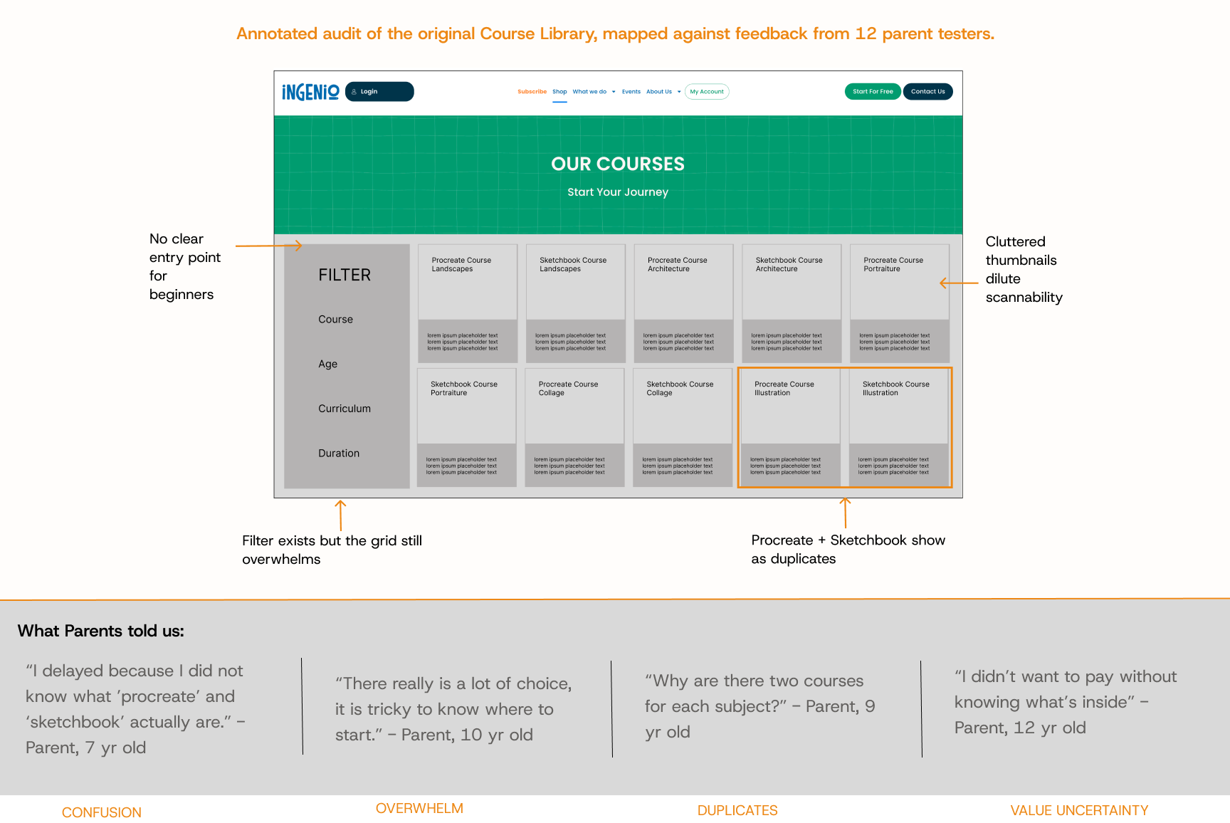
We were getting good traffic to the Course Library but seeing high bounce rates and low conversion. Light user feedback surveys revealed three recurring themes: parents felt overwhelmed by 100+ individual courses; they were confused by course duplicates across different drawing apps; and they couldn't quickly judge value before committing to a one-off purchase.
Users & Audience
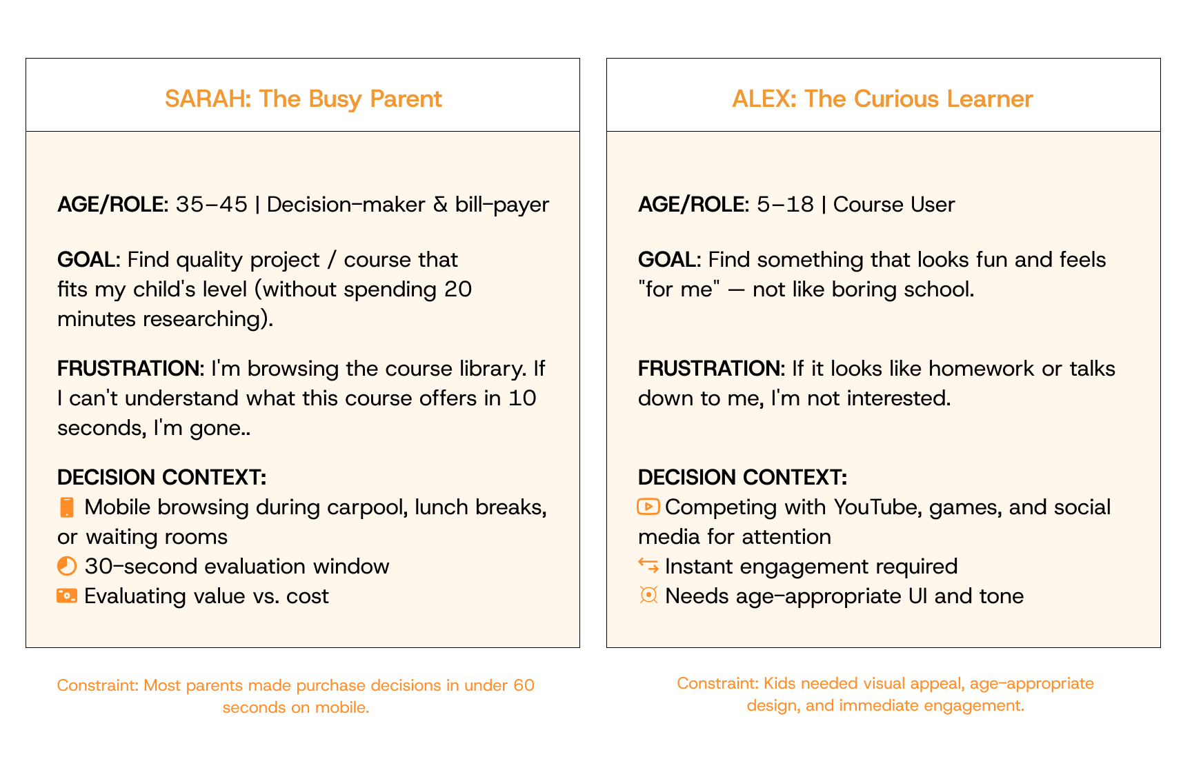
Two primary user groups: parents (the buyers and decision-makers, evaluating value, affordability, and educational fit for their children) and kids aged 5–18 (the end-users, who needed engaging, age-appropriate content). Most purchase decisions happened during a brief, distracted browse — so the Course Library had to communicate value in seconds, not minutes.
My Role
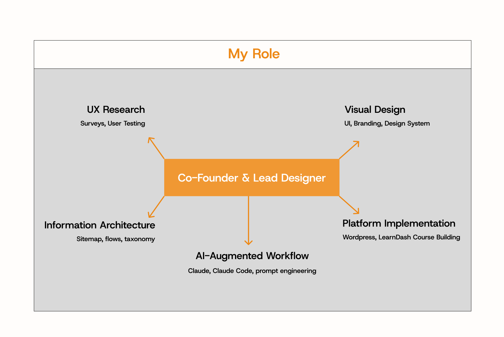
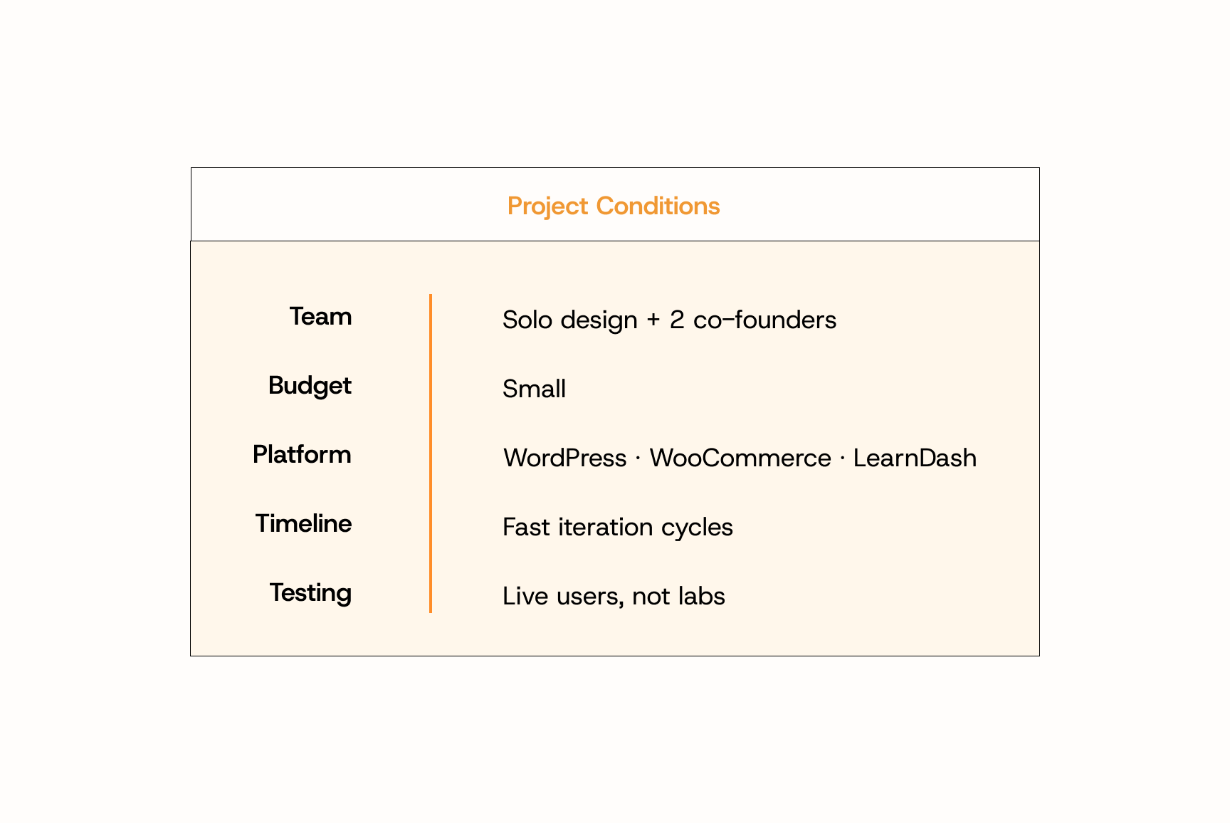
Co-founder and Lead Designer. I owned UX research (light feedback surveys, synthesis, prioritisation), information architecture, visual design, and platform implementation. Alongside two co-founders, I shared decision-making on pricing, positioning, and product direction.
Scope & Constraints
Built on WordPress, WooCommerce, and LearnDash with no dedicated engineering team. I implemented the redesign myself, which kept iteration fast but meant every design choice had to be feasible within the existing platform. Small budget, small team, and a need to test changes quickly with real users rather than via lengthy research cycles.
Process & What I Did
- Listened first. Sent lightweight feedback surveys to existing users. Synthesised responses into three core pain points: choice paralysis, course duplication confusion, and unclear value.
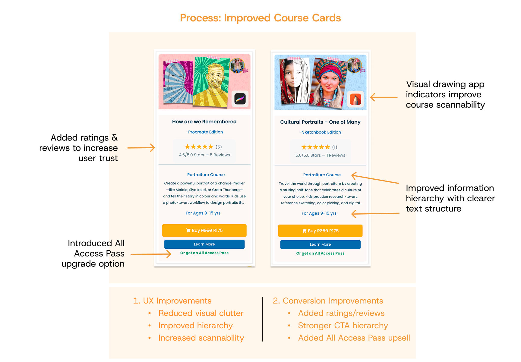
- Simplified the Course Library. Redesigned course cards to be visually-led — drawing app shown at a glance, one-line description, less dense copy. Cut the visual noise so users could scan rather than read.
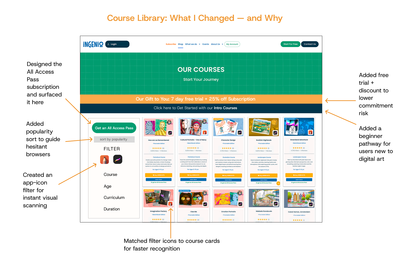
- Reframed the pricing model. Introduced an "All Access Pass" monthly subscription priced just above a single course, and surfaced it across multiple decision points throughout the funnel.
- Built it. Implemented the entire redesign myself on WordPress / WooCommerce / LearnDash, allowing fast iteration without engineering bottlenecks.
Outcomes & Lessons Learned
The visually-led course cards directly addressed the "Procreate vs Sketchbook" confusion parents had reported — the app-icon system meant they no longer had to decode which version of a course they were looking at. Reframing the pricing around an All Access Pass gave parents a clearer way to weigh value: instead of judging a single course in isolation, they could see unlimited access at one monthly price. And surfacing the pass at multiple points in the funnel — rather than burying it — made the subscription a visible option at the moments parents were actually deciding.
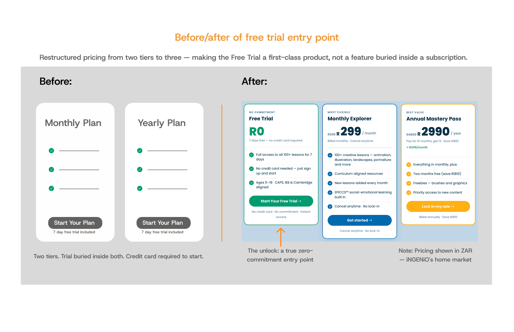
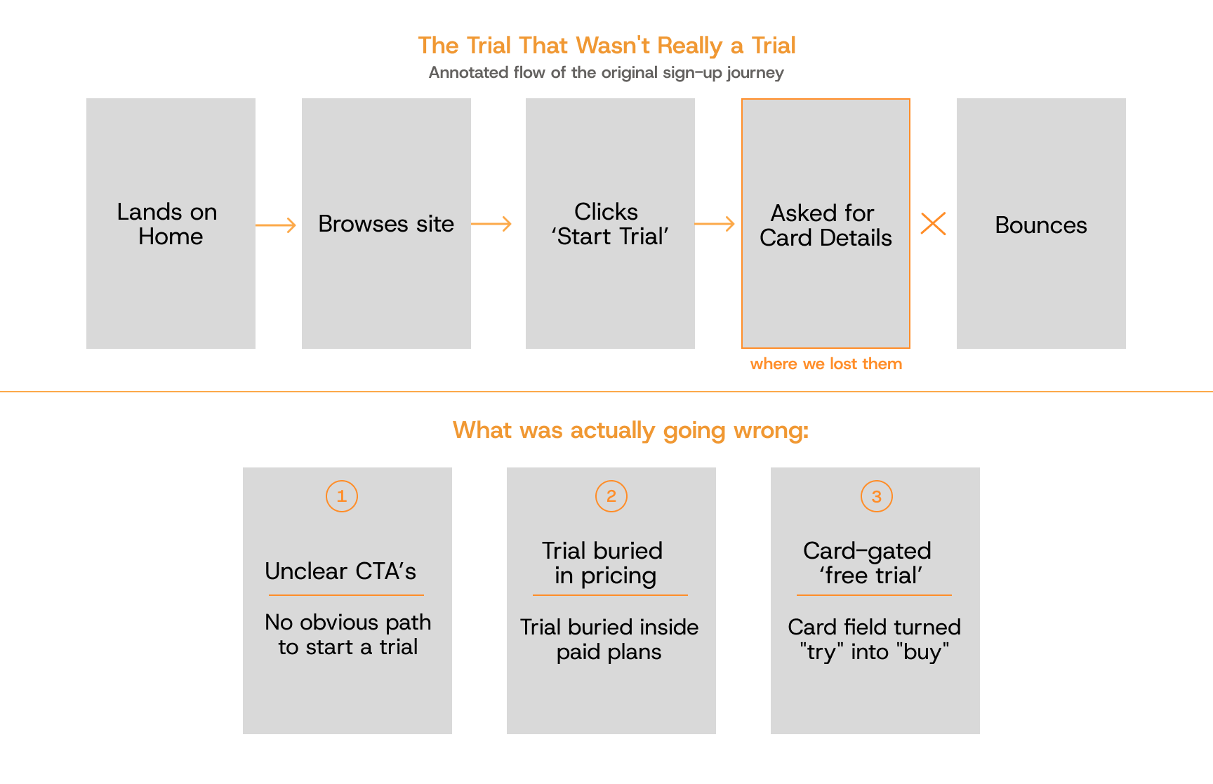
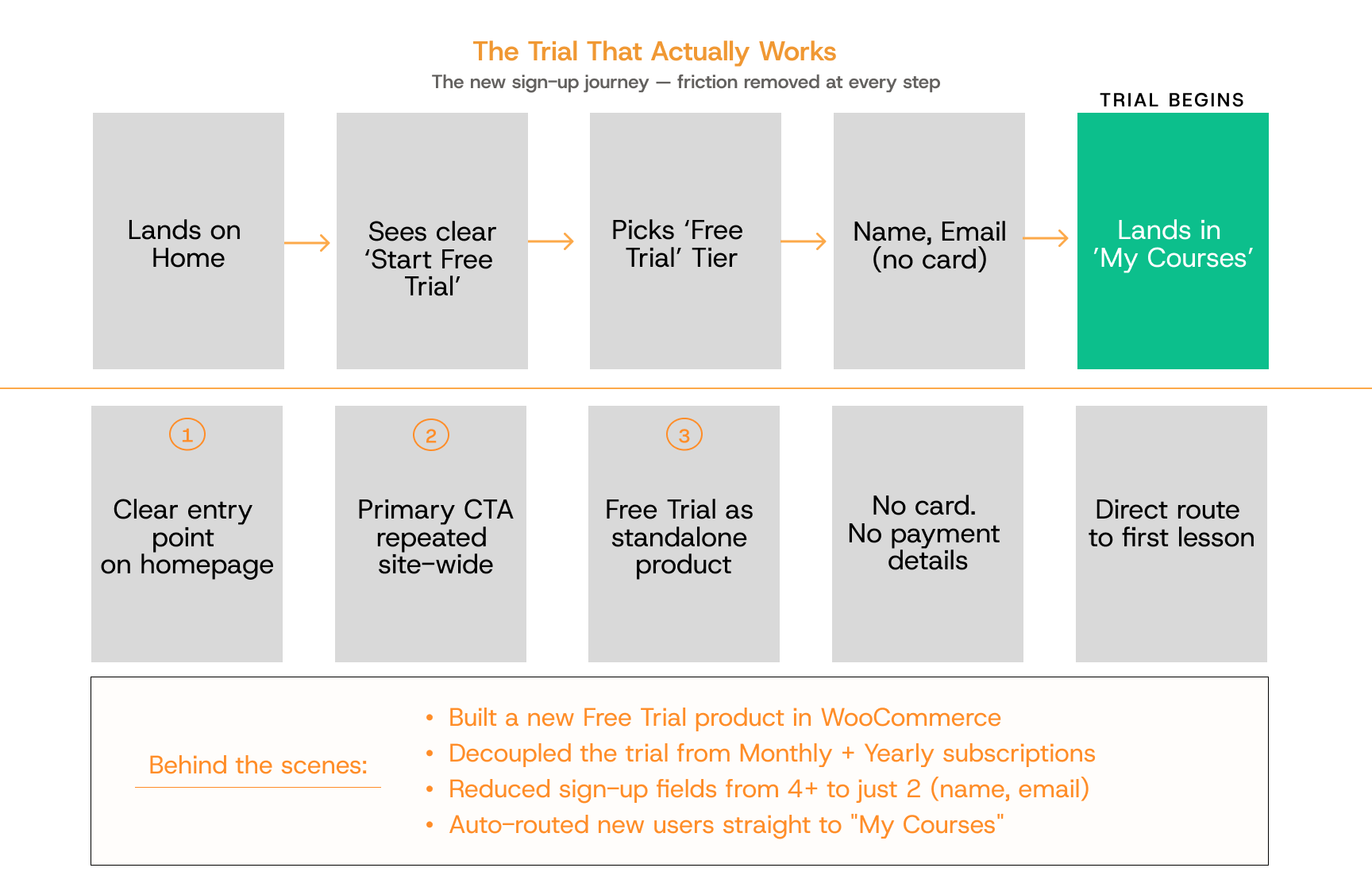
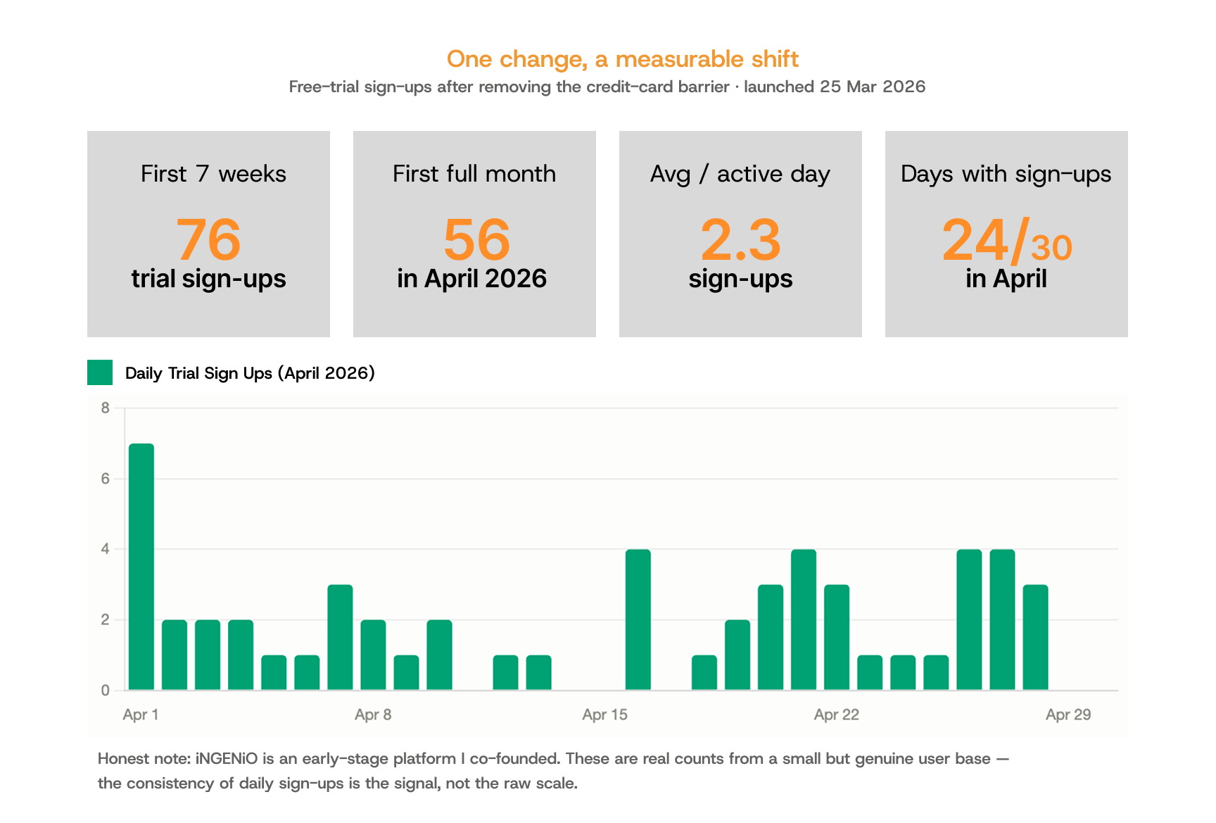
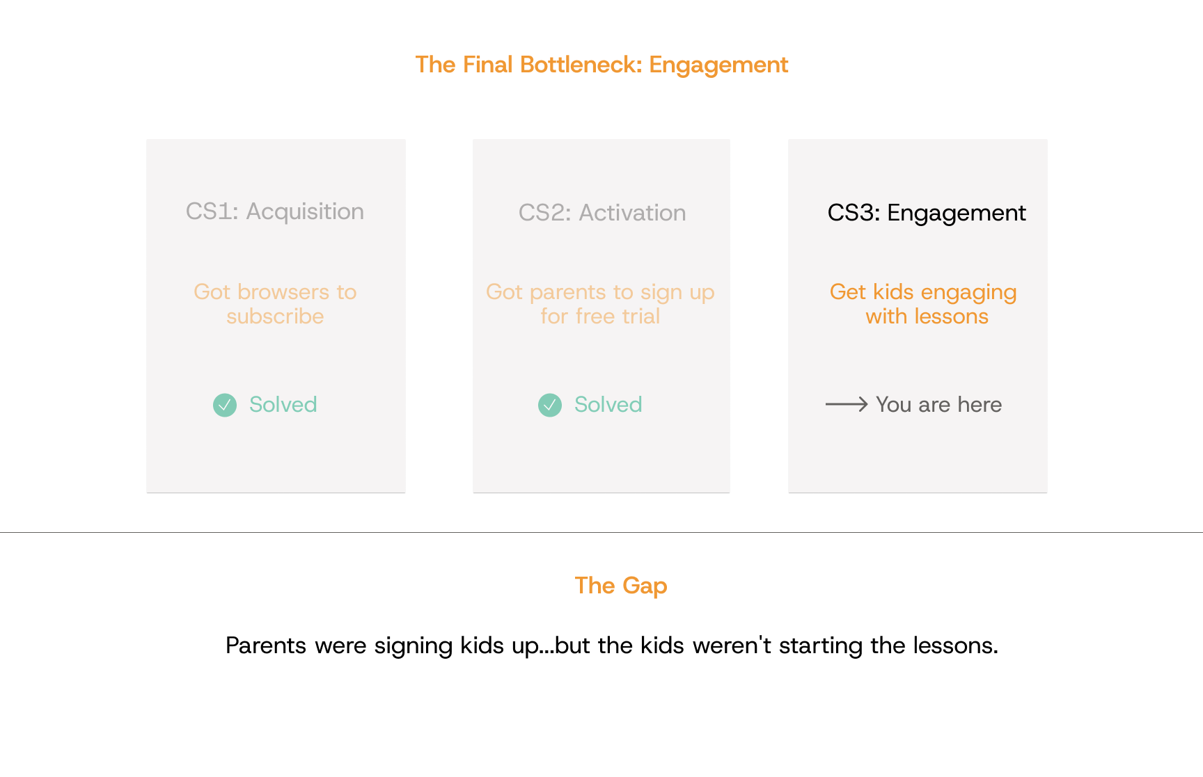
The biggest lesson: solving one bottleneck reveals the next. Once the library was easier to navigate and the pass was visible, a new problem moved to the front — the free trial itself was gated behind a credit card, suppressing sign-ups. That became Case Study 2, where the impact was clearly measurable.
Honest note: iNGENiO is an early-stage platform I co-founded. CS1's improvements were qualitative — clearer navigation, reduced confusion, a more visible value proposition. The measurable conversion shift came later, once the trial friction was removed (see Case Study 2).
How I Used AI in This Project
I used Claude (Anthropic's AI assistant) and Claude Code throughout this work: prototyping HTML/CSS variations of redesigned components in hours rather than days; pressure-testing the All Access Pass pricing model before committing build time; and accelerating WordPress / WooCommerce / LearnDash customisations.
What AI didn't do: the design decisions, the user research synthesis, or the judgement calls on what to build. My workflow treats AI as a fast junior collaborator — useful for execution speed, but always reviewed by me on anything fact-based or strategic.